Thursday, February 28, 2013

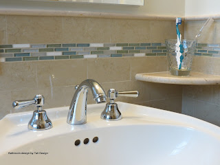
Bathroom Design - Updating from 1940s to Today

My latest design was a kids bathroom.
As you can see at the before images, the bathroom was from the 1940s. Still functioning but dated.
The client wanted me to transform it into a "nice clean design" bathroom "with kids in mind".  A bathroom that can be used by both the children and the occasional house guests.

My challenge was to keep the design clean using warn colors, with kids in-mind.

At my design I managed to utilize the sink and toilet. Kept the layout as is (to reduce cost) but did make a few changes in the layout of the electric outlet heat duct and ventilation.


At the original design, the air duct was located above the shower head. What made people that used the shower freeze the second they turned off the water. We moved the duct to the center of the ceiling above the toilet.

Another change was an up-to-code electric outlet. The light fixture above the medicine cabinet was replaced and we added a light above the bathtub.
Last but not least, was a vent that was added to allow ventilation when not using the window.

The kids reaction when we reveled the bathroom was - WOW...
What do you think of the final product?


Before pictures


After pictures


Till next time,
Tali

Friday, September 28, 2012

Decorating a shared space - Living/Dining Room


I hear a lot of people asking how to set the layout of a room where the Living room and Dining room are sharing the same space.
In today's house, it is common to see the Shared Space Design as oppose to two separate rooms, one for living and the other for dining.
ieces furniture
How can you decorate it and still keep it separate? Every room is different, I cannot give you a generic answer. Something that will work for one space may not work for the other, but I will do my best to give you guidelines to better assist you laying out your room.

First things first...Figure out what your needs are
Do you entertain a lot? Do you need a big dining table or will a small expandable table be enough? Do you have a breakfast area in the kitchen, maybe there is no need for another dining area? Is there going to be a TV at the living room? etc. etc.

Second, measure your room.  If you can, sketch it on a piece of paper. 
Remember to include the measurements of all walls, doors and windows in your sketch (to scale).
Sketch your furniture (again, to scale) on a different piece of paper, cut them and experiment with them in different positions on your plan (you can also do this on your computer if you know how to use a simple drawing program). This sketch (your floor plan) is also helpful for when you go and select your furniture.


Third, if the room is not in a rectangular shape, consider using the smaller area for the dining area.


Small room dedicated for both purposes - 

a mirror is placed above the fire place to give the illusion of bigger space

For a rectangular shaped room look for the architectural clues in the room. For example a fire place is usually the anchor for the Living room; Bay windows can play a part in defining the Dining room. Where is the kitchen in relating to the room, you don't want to go through the entire space just to serve food...; and so on and so forth.

After you figured out the designated space for each area, here are some ground rules to decorate them.
Try and design the areas so there is an anchor with light and an area rug. Have a chandelier above your dining room table to define it's space.

Create focal point, or emphasize an existing one to make the illusion of separation. For example, if there is a fire place, decorate the living area around it.

You can also use glass-top table  with clear chairs to visually expand the space and make it feel bigger and less clutter.

Furniture position - This is a tricky one. Some will say, face the big sofa with it's back to the dining area. 

Luxury Room at Inter Continental NY

The sofa will create a visual separation between the areas, not everybody like this idea and they want to keep the flow of the open space design, nothing here is written in stone it can work both ways (In a long rectangular room I would avoid it). 
If you do use the "floating sofa" design, place a console behind it to use for storage to serve both zones.


Whatever you do, do not clutter the room by trying to force too many pieces of furniture into it, and always leave enough space around the furniture for people to move freely.

Last but not least, at your design you have to remember that both areas share the same space. You want to pick up furniture and accessories that will give a cohesive look. Try and avoid using too many different colors and shapes.


You can also check out my post about decorating a big room before you start,  for more design ideas.

Till next time,
Tali

Thursday, July 12, 2012

Too funny designs

Who said Interior design needs to be so serious. Sometimes when we go back home from our busy and stressful day we want to go to a relaxing, fun & yet sometimes funny, home.

I gathered here some fun designs for your inspiration or just to make you laugh 

This is a funny & creative shelving unit, you can use the middle area as a bench, or just keep the skeleton. 


This is cool and funny penguin mirror motifs incorporated in a very serious design.
With the selection of these furniture and color pallet and adding the penguin twist, the room becomes more fun and yet elegant.


Who said furniture need to be in standard geometric shapes?! Here is a great example for a fun drawer unit. 
Perfect for any room, not just the kids room.


This is a funny chair design. A very unique look designed by Lila Jang.  This chair can also be used as a bed.


Last but not least, my favorite outdoor chairs, here I think the image can do the talking.


Till next time,
Tali

Interior Design Going Green


Going Green is not just a phase, it is here to stay. More and more are growing their own herbs & vegetables, buying organic and looking for a way to incorporate green in their homes. At this post I am trying to share simple rules to help you  have your house more eco-friendly.

eco friendly paint
When Going Green, use the known "Reuse - Renew - Recycle" rule. 

Reuse furniture by having pieces repainted with non-toxic paint. Reupholster your furniture with organic textile.
When you decide to replace your furniture or appliance, check the option of donating it to charity.

Plant Chandelier
For your carpet, look for the ones made out of natural fiber, like organic grown cotton, jute, sisal, sea grass or 100% sustainable New Zealand wool.
For your walls, use PVC-free wallpaper and blinds, and low or zero VOC paints.

When picking up new appliances, look for the Energy Star, which means this machine is energy efficient. The same is with your light bulbs, replaced your light bulbs with light bulbs that marked with the Energy Star, they use 75% less energy and produce less heat that the regular ones.

The Tonecoon chair is made of renewable water
hyacinth which is wrapped around its frame
Install low-flow shower-heads and faucets to reduce your water consumption. If you don't want to change the fixture, try this easy fix - add an aerator, which screw on to the end of the faucet, mixing air with water, they don't reduce the water pressure but will reduce the flow and save you water and money.  


For new toilet, try and get the low-flow dual-flush toilet, that allows you to select between two flow amounts - one for liquids and the other for more solid waste.


Recycled metal wire flower platters by Shiraleah 
Look for accessories that are environment friendly. Accessories as well as furniture can be found that are made from organic materials, hand made, and also made with recycled materials. More and more can be found that are green and gorgeous.


And for the final touch, place live plants around your house. They help clean the air. Try to avoid the dozen roses from the store, They are usually pesticide-sprayed roses, which are toxic and exploit workers. 

Till next time,
Tali


Saturday, June 23, 2012

Scale - making a small room look bigger and a big room feel cozier

You walk into a room and you feel like you are  Gulliver in Lilliput, or maybe the other way around as if this room is too big for you. What should you do?

If you get the sense as if the dimensions of the room are smallish - meaning you are like Gilliver walking in Lilliput - you want to create the illusion as if your room is spacious.
Getting the feeling of small doesn't mean that your room is really small, it means we need to work and organize it so you will not get that feeling anymore.

Here are some ground rules for you to follow:
First, Think Small.
You don't need kid's furniture, but you also don't need the four seater sofa. Make sure your furniture scale is small. Window treatments are simple. If you are using fabrics with patterns, make sure the design motif is small.

Second, use Light colors on the walls and Dark color for the furniture.
Light colors on the walls expand the sense of space. If you are using drapes, use a light colors for them as well.

Small Living room that feels just right

Do you know the phrase, "Black makes you look thinner". This phrase does also apply to your furniture.
Maybe not in these exact words but the concept is the same. Darker furniture look "better" in a smaller space. If you use a light colored upholstery fabric, you make the furniture look bigger. 
Again if you want to use pattern on the furniture, choose a motif with a small design. 


Third, Aim for unity.
Try to use matching furniture with the same fabric on them. Window treatments that continue the flow of the walls and not break it up (if you are using a wall paper, try to use a matching drape).


You get the idea on a small room, now what do we do for a big room? exactly the opposite.
A large living room that feels nice and cozy
For a large room we want to give a cozy feeling, so our ground rules should be:
First, Thinking BIG.
Big furniture, elaborated window treatments. Big and bold patters on your upholstery.

Second, Dark colors on the walls - Light colors on the furniture.
When painting the walls in a darker color we get the illusion that the walls are much closer than they really are.
As appose to the smaller room, we want our furniture to have the feeling of big, so we need them to be in a light color and/or with a big and bold patters, otherwise they can "get lost" in the room.

Third, Diversity.
A large living room that makes you feel as it's too empty
Big rooms can handle different patters on the furniture (just don't take it to the extreme with each piece with a different patter).  You want the window treatments to stand out in contrast to the rest of the walls so they break out the large expanse of the walls. You can also use an Oriental rug.

Decorating your room is a challenge, but now you know what to do.

Till next time,
Tali


Monday, June 18, 2012

Living room design with kids in mind


As a mom for three young children, I always concerned for my kids' safety.
As an Interior Designer, I always consider how my house looks.
Do the two have to conflict? Not necessarily.

I remember as a teenager I used to baby-sit my neigh borer's two young children.
Their mom collected antiques. I remember whenever I came to stay with the kids, the rules were very streaked "Kids can only play in their room and eat in the kitchen".
The kids knew the rules and were terrified to break them.

My parents, on the other hand were very easy going. My siblings and I could hang wherever we wanted as long as we are safe.

At my house there is a balance (I hope) between the two approaches.
My Living room is sophisticated enough for adults and still safe for young children.

How can you accomplish that? place something in your living room that your kids know they can touch.
That way, when they are in the room it's not all "off limit" for them.
I once designed a room where there is a special drawer in this beautiful antique table, all filled with the toddler's toys. She loved it and the room still looked clutter free.


Coffee Table with Accessories that are kids' friendly


Of course if you have a big house and you can have two living spaces, one more kids friendly and one formal there is no problem for you, but just in case you don't there is a solution.

Till next time,
Tali

Saturday, June 9, 2012

Lighting fixtures - Interior Design 101 or No idea what are you talking about

Before I studied Interior Design, I had a feeling on where things should be placed in a room, what colors should I use etc., but I had no idea how they were called.

So in this first 101 session I plan on giving you some guidance so you will talk like a pro!

In this session, we'll be talking about Light.

Lighting fixtures are divided into five categories, depending on how they are placed in the room:
Wall Fixtures, Ceiling fixtures, Indirect Lighting fixtures, Floor fixtures and Table fixtures.
Each type of light serves a purpose. I am not trying to explain their purpose now just give you the idea of what they are.

Wall fixtures are mounted to our walls like Sconces, Swivel arms, Makeup light and Wall cans. The light that they cast can be in different directions. Some up, some down and some both up and down.
* Something very important to remember, when placing a sconce place it 5'6" from the floor.
Wall Light - light spread up and down

Ceiling fixtures, are what we use to see on the ceiling.
It is usually a socket in the middle of the ceiling and it gives a lot of light. A chandelier is a perfect example.
Other ceiling fixtures are Downlights which are the modern version of a chandelier. It can be recessed downlights, surface mounted downlight and track lights.
Each provides light from the ceiling down to the floor but it will be spread differently.

A combination of two different ceiling lights - see the light spread?
Indirect Lighting fixtures provides, as you probably guessed from it's name, an indirect light. These types of fixtures often provide subtle, yet dramatic, ambient lighting in a room. Why is that? because they provide soft even lighting on a large area. Their light reflects on a surface such as a wall or the ceiling.
Falling under this category are the in-cabinet lighting,  under cabinet lighting and indirect window lighting (i.e. light behind a valance).

Dramatic light

Floor fixtures are referred to fixtures that rest on the floor. Floor lamps and floor cans falls under this category.
Today's selection of floor lamps is huge and as you can make a design statement with a chandelier, the floor lamp is also the way to do so.


Table fixtures are fixtures that rest on a table. They are less likely to be used in Contemporary designs.


In every room you design there should be a combination of at least two of the above types.
Ceiling light and under cabinet light


Till next time,
Tali